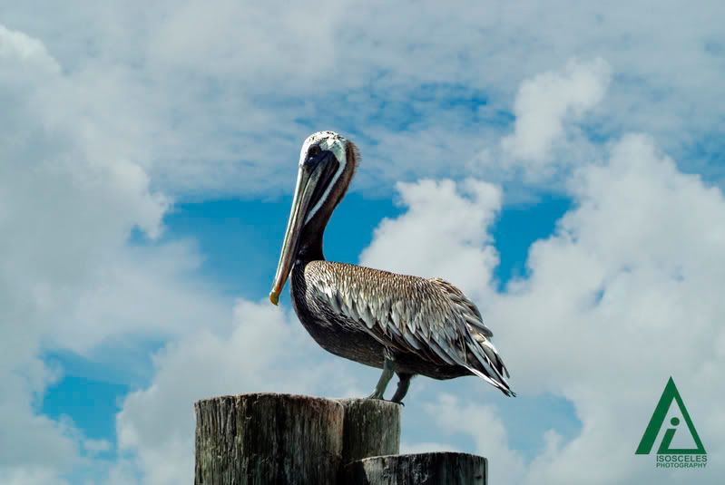
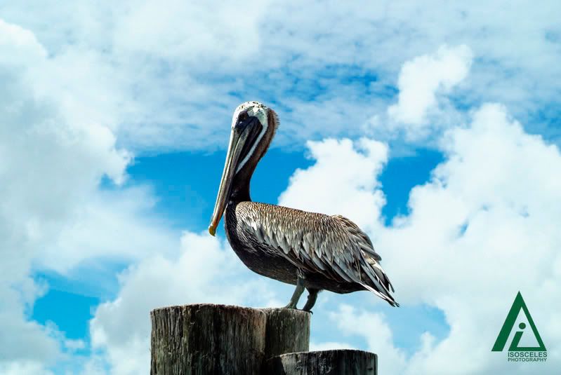
Which one do you like better, and why? (in Off-topic)
Mem
October 10 2007 10:30 PM EDT
#1
#2
Your input, as always, is appreciated. ;)
hands down i would have to say 2...its just so much more vibrant and you can see everything better and clearer
the second one. just seems so much better being brighter and sharper
BootyGod
October 10 2007 10:40 PM EDT
Second one ^.^ I like the clarity.
2 as well, "vibrant" pretty much sums it up
ScY
October 10 2007 10:49 PM EDT
I guess it depends on what effect you are going for. If I were doing a documentary on that bird, and I wanted a pic of it, I would pick #1. But if I were going to make a Postcard, I would use #2, only because of the brightness.
Number 1 is my personal favorite because everything seems more textured, and the bird is at the forefront. (Clouds are dulled, but the bird only seems more prominent)
Mesoshort
October 10 2007 10:57 PM EDT
Yeah, the second one looks photoshopped. Everything is too ... prominent.
48Zach
October 10 2007 11:05 PM EDT
2.
Looks better.
Mem
October 10 2007 11:07 PM EDT
They are both Photoshopped, though not heavily. If you look closely you will see that the exposure on the bird and the moors remain constant in both pictures. The only thing that changes is the saturation on the clouds and sky. The first one is desaturated, and the second is slightly saturated. The actual color lies closer to #2. As scytale pointed out, though, the questions is, does the desaturation make the bird stand out more, since he's the main subject of the photo (it's scientifically proven that the eye is attracted to the bright parts of a photo). Or does it not matter in this case?
j'bob
October 11 2007 12:36 AM EDT
I like the first picture. The contrast between the clouds and the sky in the second picture is on the verge of being distracting. Though the first picture appears "darker" I think it's better for focusing on the bird.
Well, either picture, the birds head is the "bright spot"
But i like #2 more, #1 looks too much like a polaroid, it reminds me of those nasal medicine commercials, #2 is much clearer.
Xenko
October 11 2007 12:58 AM EDT
#2.
Brighter, more vibrant. It just looks happier.
#1 looks like the bird is the last survivor of an apocalypse or something... a more gloomy photo.
QBJohnnywas
October 11 2007 2:54 AM EDT
I like 1 better. 2 may be brighter, but 1 feels 'warmer', it feels more interesting as a composition as well. Something about the colour of the sky and the clouds contrasting with the bright/sharp of the bird.
Wasp
October 11 2007 3:15 AM EDT
I prefered #1. It brings the focus more on the bird, as apposed to the clouds. The second one is vibrant but it distracts you from seeing the image. Does that make sense?
Iluvatar[NK]
October 11 2007 3:18 AM EDT
2 seems forced.
The first is more natural.
It really depends on what you're using it for. For commercial purposes, #2. For personal use, prefer 1.
#2
"The first one is desaturated, and the second is slightly saturated. The actual color lies closer to #2. As scytale pointed out, though, the questions is, does the desaturation make the bird stand out more, since he's the main subject of the photo "
No. The first looks duller, and by extension makes the bird look duller (even though it isn't). Check between the birds back in both photos.
The lighter photo offers more contrast between the white clouds and the dark of the birds back. The first blends the two more, and draws the bird into the background.
This effect is reversed on the head of the bird, but there's not enough to take attention from the larger white cloud mass at the birds back.
;)
Plus the neck.
The neck is very dark, and the contrast of that to the lighter blue of the sky in the second makes the bird stand out more.
Flamey
October 11 2007 4:49 AM EDT
I'd have to say 2.
IndependenZ
October 11 2007 6:30 AM EDT
I also like number 2 better. It's indeed more bright and vibrant, but I also think it looks more authentic. The first one looks literally like the sky has been darkened: you don't see many birds in the sun when the sun's not out.
BluBBen
October 11 2007 12:22 PM EDT
I bet they are both photoshoped but I think that the second one looks more natural. Thats all I got to say: :-P
They were both Good!

The second one seemed more enjoyable but the first one did stand out more . In the whole I wished for a close-up of the bird, without a shadow on the neck, enough to see the small neck feathers.
th00p
October 11 2007 5:11 PM EDT
I like #1better.
#2 is happier, but...
#1 gives the impression that a storm is heading in and the bird is bracing for it.
But maybe I'm just pessimistic.
both are really nice mem. Are you using them for advertising? If so then #2 since it is brighter and more eye catching. If its something you're going to hang on your wall I'd go with #1.
Mem
October 11 2007 5:33 PM EDT
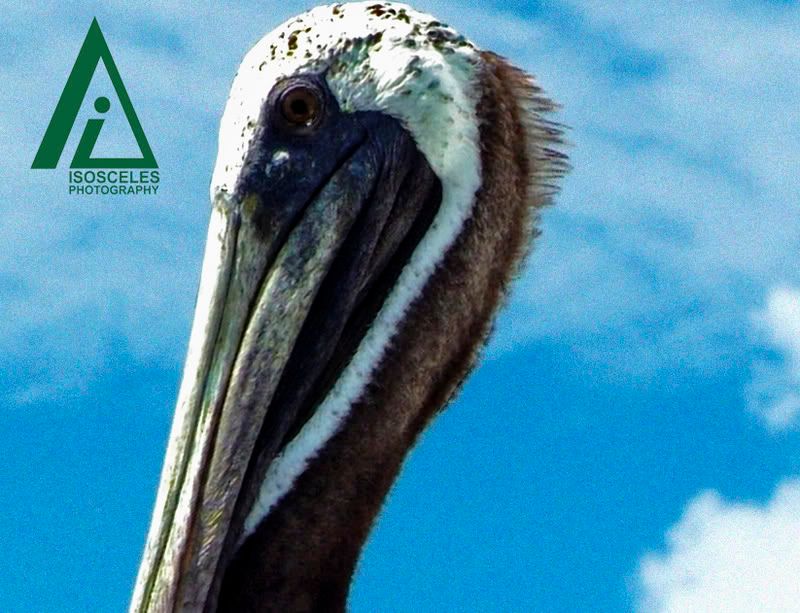
Slash, you have to understand that the photo you are seeing has had about 4/5 of the data wiped away due to the compression of Photobucket. Here's a closeup of his face-- the detail you're asking for is there. You just can't see it all that well due to the size limitations and such.
I didn't express my self correctly . I guess I meant that either photo did its job by making me want to study the bird . To me a photo should make you have that reaction.Oh and I think its the depth behind the second one that grabs me if you could keep the depth but reduce the backgrounds color a little, probably everyone one would go for that one .... maybe. lol!
8DEOTWP
October 11 2007 9:41 PM EDT
#1.5
This thread is closed to new posts.
However, you are welcome to reference it
from a new thread; link this with the html
<a href="/bboard/q-and-a-fetch-msg.tcl?msg_id=002FDy">Which one do you like better, and why?</a>


 The second one seemed more enjoyable but the first one did stand out more . In the whole I wished for a close-up of the bird, without a shadow on the neck, enough to see the small neck feathers.