Which one do you like better? (in Off-topic)
Mem
November 11 2007 1:43 AM EST
or
?
phrog
November 11 2007 1:47 AM EST
What happened to the original? Wasn't it a green/gold color? The first one you posted was better than both of these.
Iluvatar[NK]
November 11 2007 1:52 AM EST
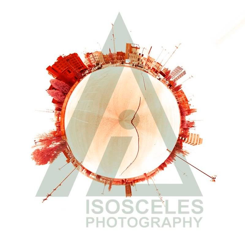
The second. There's something to be said for Spartan cleanliness in this day and age. With the preponderance of Photoshop-manipulated images running about, graphical enhancement and modification is somewhat expected. However, there's no need go go overboard.
chuck1234
November 11 2007 1:56 AM EST
the solar background on the upper photo has a better appearance on account of the extra detail; maybe you can keep the logo space clear of that solar background, i.e., keep the characters and font and background as in the lower photo for the "isosceles photography" logo, but retain the background, etc. of the top part...you can experiment with other colours too.
i have to say the second one, mainly because i don't like how the clouds look on the first. its also due to the fact that the coloring on the second also looks far better than the first.
Mem
November 11 2007 3:51 AM EST
Phrog: http://carnageblender.com/bboard/q-and-a-fetch-msg.tcl?msg_id=002FZ2
That was a completely different image, taken over a 1000 miles away.
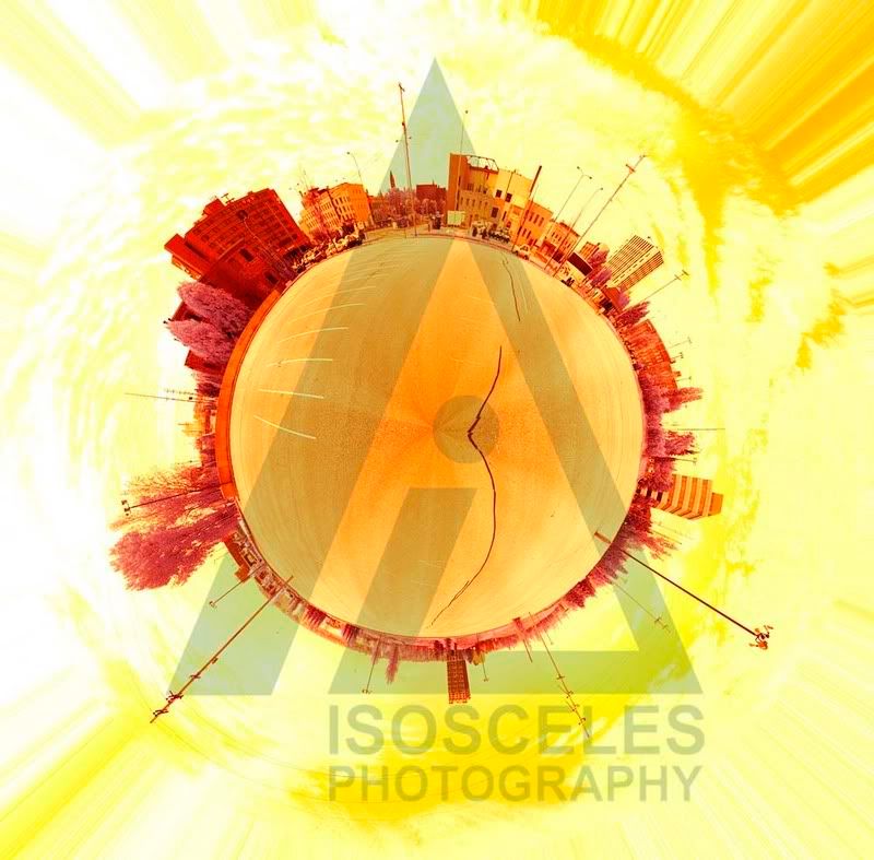
NK: In all actuality the top image is very close to what it originally was (not counting the fact that the original "image" was actually 18 different images taken in infrared). The only change to it is some slight color correction. The bottom picture has drastic color correction-- the only one that could be categorized as "overboard".
Chuck: I have no idea what you're talking about. The logo is only there in the case of thieves. When I actually am going to display the photo it will be completely devoid of the logo.
Lightning: At least someone realized those were clouds...
Flamey
November 11 2007 4:06 AM EST
2nd one.
Speaking of the clouds, they look like a sun that's in supernova to me :P
i like the second one as well. even if it actually is less natural it appears more so.
phrog
November 11 2007 9:24 AM EST
Hmmm... Oops... Shows how much I was actually paying attention. I will try again.
I'll say I like the top one better. I don't really care for the yellow hue, but the building look better than the bottom one.
Mem, can you produce a stereogram of a shot like this?
QBRanger
November 11 2007 10:06 AM EST
The bottom one.
Less busy, easier on the eyes.
Mem
November 11 2007 10:52 AM EST
I have no idea of how I would go about that, Phrog. I'm sure it could be done.
And by the way, if it's created in the computer it's called an autostereogram...
Mikel
[Bring it]
November 11 2007 11:07 AM EST
I like the first one better. More colorful and the yellow reminds me of the Sun, which you would expect to see.
The second is clean, but boring.
both... The second is less my favorite, however the sepia tones of the buildings and trees look awesome to me
th00p
November 11 2007 2:09 PM EST
The second one.
But I'm stupid.
th00p
November 11 2007 2:10 PM EST
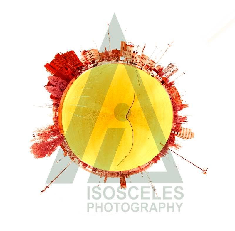
Double post! Could you put the yellow only inside the sphere? That'd be amazing.
BootyGod
November 11 2007 2:15 PM EST
Second one. At first, I liked the gold flavored one. But it took away the rather striking central portion of the picture. So after a few more seconds, I decided that the second one is better ^.^
[P]Mitt
November 11 2007 2:19 PM EST
I like the first one. Nice, clean, crisp, and no huge yellow background to detract from the details.
Mem
November 11 2007 5:31 PM EST
Like this, th00p?
This thread is closed to new posts.
However, you are welcome to reference it
from a new thread; link this with the html
<a href="/bboard/q-and-a-fetch-msg.tcl?msg_id=002H91">Which one do you like better?</a>