
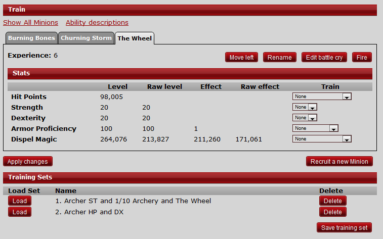
I often find myself clicking or almost clicking buttons on the training page that I don't want to while training; sometimes Save Training Set, sometimes Move Left. I think the whole horizontally back and forth between Load and Apply changes is what ends up throwing me off, along with the numerous buttons that blend in with the headers as well.
I stared at it for a while and thought, what are the vast majority of button clicks happening on the Training page? I'd be willing to bet that they are "Load" training sets and "Apply changes" pretty universally.
With that in mind, I'm suggesting just a minor shifting of the buttons on the training page -- everything stays in their same rows etc., just shifted left or right. (Okay I guess the Experience "row" would merge with the buttons beneath it to save unnecessary whitespace.)
Basically, make Apply changes and Load the only things that are left-justified, and right-justify everything else. I think this provides a nice visual break of the most commonly used buttons, as well as keeping them right in the same area above/below each other. There is no way I'm accidentally going to click one of the other buttons when training, no matter how little attention I'm paying at that moment. (=
Mockup:
Thoughts?