First victim of the re-theme: auctions (in Changelog)
AdminJonathan
October 15 2007 11:33 PM EDT
Auctions is now live on the new theme. Thanks to Pixel, NightStrike, and Spydah for their help.
AdminJonathan
October 15 2007 11:34 PM EDT
As discussed in other threads, the old custom themes will not work with the new engine until Pixel or someone else ports them. Unfortunately, it will be premature to do any porting until we're done.
AdminJonathan
October 15 2007 11:36 PM EDT
Some other pages look different because there is some overlap of new/old CSS, but don't complain about those yet because they are not done.
Feedback on auctions is welcome.
hehe, nice i was tweaking out stuff quit working on me ^.^
SNK3R
October 15 2007 11:38 PM EDT
Feedback:
All 6 lines under "Details" under a specific item in Auctions seems REALLY spaced out for no apparent reason. Any particular reason? If not, I'd like to see the space cut-down.
Relic
October 15 2007 11:40 PM EDT
Not too bad as a first attempt. I would suggest making the individual auction tables 100% width so you don't have weird wrapping and varying degrees of width for each item sub-heading.
Relic
October 15 2007 11:41 PM EDT
Also, there really needs to be a row hover for any tables with more than two columns so readability is easier.
Maelstrom
October 15 2007 11:44 PM EDT
Cool, I didn't know the new theme would be going up so "quickly". Looks great, with a few minor issues.
As mentioned, there are line break issues on the details page.
Also, on the auctions list page, the tab spacing between the different item type sections is not consistent in the main search screen. Fix this?
SNK3R
October 15 2007 11:44 PM EDT
When using a theme other than the default (like SNK3R), and visiting to the Auctions pages, you see a large black horizontal bar going across at the top.
(Modern Mono also does this.)
Relic
October 15 2007 11:50 PM EDT
I would be happy to fix the various things on the auctions page(s) if you would like Jonathan, I don't know if you still have the dev environment setup, but I am available to help if need be.
good change on making the text bigger ^.^ it made the page seem huge with the tiny text
the checkboxes for only show expired items though would look better on one line IMO
Maelstrom
October 15 2007 11:52 PM EDT
Looks like weapon and armour shops are being worked on... still single column, though ;)
SNK3R
October 15 2007 11:52 PM EDT
Stores:
1) Line-break issues (mostly for the top of the page).
2) Word-wrap issues (listing all the items).
3) Are we really going to only have one column? Do we want people scrolling down 500 pages just to see what's in the Ranged Weapons category? (Maybe you can put links that transfer you to that particular section of the page at the top and bottom?)
We lost the supporter italics and QB/Admin tags, I think.
SNK3R
October 15 2007 11:56 PM EDT
The one-column in the stores isn't centered. (Possibly caused by the word-wrap issues?)
Goodfish
October 16 2007 12:28 AM EDT
Agreed with SNK- The store is nearly unbearable... Seeing items with their stats listed on up to three lines is a bit irritating.
After a few seconds, auctions looked really clean. Very nice work, Jon! And everyone else, of course. Certainly very different, though!
Lord Bob
October 16 2007 12:34 AM EDT
Gah! I fear change!
But seriously though, auctions looks pretty cool, but I'm not sure I like all the extra space on the right.
Stores look like a fat man's bum right now.
lostling
October 16 2007 12:59 AM EDT
its laggy
phrog
October 16 2007 1:47 AM EDT
I'm all for the update going forward, but right now it is looking like a step back. The line break issues are really bad. The stores need a more compact format like they were when we got up yesterday. Keep up the good work. I'm sure the details will be worked out.
PoisoN
October 16 2007 2:08 AM EDT
Sorry I'm too lazy to post the html in here and fight the spellchecker.
Some of my notes to strict html and the front auctions page.
My notes.
Sacredpeanut
October 16 2007 2:24 AM EDT
A couple of minor things:
1) How about a bit of blank space at the bottom of the search auctions page? At the moment it seems to end a bit abruptly after explosive shots.
2) A bit less space between "actions" and "sell item", "view" and "my bids", and "search" and the search box because at the moment the text under the sub headings on the left side seams to be a bit "lower" than it should be. (Alternatively a bigger gap between the end of each sub category and the heading of the next one).
Noooo My time of posts tags are gone on forums and chatmail for anything other than today!!!! Bring 'em Back!
spydah
October 16 2007 5:51 AM EDT
This change gives Todd an unfair advantage
/\88/\
Is the store going to stay 1 column? If so, i could see camping coming back with rares, it takes 5 minutes to scroll all the way down the armor stores [/sarcasm]
But still, i hope it becomes two columns. I saw SNK4R say it wasnt centered, which i assumed to mean it was going to stay 1 column.
48Zach
October 16 2007 6:34 AM EDT
Auction is nice
Store is terrible.. It's MUCH too spaced out.
48Zach
October 16 2007 6:46 AM EDT
About store having two coloumns -
As it stands, there wouldn't be enough room for two coloums as everything has gotten bigger.. PLEASE make it smaller again so we can have two!
48xVanished48
October 16 2007 6:59 AM EDT
I do like the auctions. I am aware the store is not finished. But I do not like it very much.
First thing I did this morning was look at auctions. For a sec I thought it was borked. Then noticed it was the new engine's first implementation stage. (First visible one, at least.)
Everything looks slick. Very. Thanks to you guys for the work, I appreciate that my favorite game is being made nicer, I can assure you of that. I do think however, that at this stage, it's not very ergonomical. (Note I said "at this stage", I do not know how much work is left to do, if any IS left)
Two things that bother me, without being original:
-One column is...not enough. Really, it looks good but is not efficient.
-The headers in auctions and stores being cut short, resulting in empty space on the right,(and left for store) look somewhat bizarre and do not look so nice.
That's about it :)
Wasp
October 16 2007 8:40 AM EDT
Will you be able to click a button that will enable you to use the old theme?
Talion
October 16 2007 8:49 AM EDT
Looks great.
One suggestion: Width=100%
QBRanger
October 16 2007 9:31 AM EDT
As far as auctions go, I really like the way it is laid out when you click on the "my bids" and "my auctions".
Very easy to see everything pertinent to those auctions.
Err, yes. I should have specified. Stores are not ergonomical. Auctions are fantastic though.
Cube
October 16 2007 10:18 AM EDT
The text that appeared when I bid.
"Placed bid. $1,500,000 has been deducted from your cash. This will be refunded instantly if you are outbid. <p> If you are the winning bidder, the item will be transferred to your inventory within five minutes after the auction ends."
The <p> in the middle.
phrog
October 16 2007 10:32 AM EDT
Auctions definitely needs to increase the width so that some items do not wrap onto two lines.
QBRanger
October 16 2007 10:33 AM EDT
Personally I like not having to scroll to the side.
Tezmac
October 16 2007 10:38 AM EDT
Seriously, the stores need to be more than one column. Seriously.
phrog
October 16 2007 10:39 AM EDT
Okay, good point Ranger. How about setting it so that each item takes two lines? (i.e., item on line #1 and stats on line #2)
Champ, it has enough room for two columns, its just the 1 column right now its almost in the middle of the right pane. Move it to the left of the window and you be able to have 2 again.
I do like auctions though. If theres enough room, you could put the search on the right side to make a 3rd column in the main auctions screen just to get rid of that white space?
no home button in the stores?
nice work, looks ok, kinda big and clunky looking text wise, loads fast so thats nice, one thing other than that is when i place a bid
Placed bid. $X has been deducted from your cash. This will be refunded instantly if you are outbid. <p> If you are the winning bidder, the item will be transferred to your inventory within five minutes after the auction ends.
there is the tag...someone forgot the rest of it ^_^
Goodfish
October 16 2007 10:57 PM EDT
I don't know if this is the result of the shift to the new theme, but whenever I fight someone on my favorites list, they disappear. Refreshing the list makes them reappear, but it's kind of irritating. Of course, I might be the only one experiencing this problem.
Maelstrom
October 16 2007 11:24 PM EDT
CyBorgin, I remember having the same problem... years ago. Are you using Firefox? If not, switch to it. Aside from that, I believe you can stop that problem by refreshing the page, or restarting your browser. It didn't happen to me all the time, and hasn't for a long long time now.
AdminJonathan
October 17 2007 1:28 AM EDT
Updated auctions some.
Flamey
October 17 2007 4:50 AM EDT
The Clan admin page is missing a header, I'm guessing that got changed to the new engine, but on the first line it says my max PR.
BluBBen
October 17 2007 5:37 AM EDT
I love the new auctions now when you have changed them Jon! :-D
phrog
October 17 2007 9:21 AM EDT
Thanks for the auction improvements.
phrog
October 17 2007 9:35 AM EDT
Now, the stores?
Lord Bob
October 17 2007 12:52 PM EDT
Auctions looks much better, but there is still a crazy amount of extra space on the right. My resolution is 1280 x 960.
Last Gasp
October 17 2007 3:04 PM EDT
I love the "My Auctions" and "My Bids" sections. Would it be possible to include a filter on them? Back in the old days of "Slayers" and "Seekers" I had a lot of bids and I'd rather not see them any longer. Too much clutter.
QBRanger
October 17 2007 3:24 PM EDT
What is also very cool is the running total of all the things you checked off to buy in the store.
For T characters it is very helpful.
QBRanger
October 17 2007 3:25 PM EDT
Is there a way to have the running total be free floating, therefore at the top of the page when you scroll down?
AdminJonathan
October 17 2007 5:31 PM EDT
> Auctions looks much better, but there is still a crazy amount of extra space on the right. My resolution is 1280 x 960.
I guess the term "fixed width" is new to you.
SNK3R
October 17 2007 5:34 PM EDT
What would be kind of neat is to get rid of the check-boxes and whenever you click on the line where the item is, it'll auto-select the item for you. I guess you could also keep the check-boxes, but the line would stay yellow-ish anyway, so it's a double feature.
Wasp
October 17 2007 5:40 PM EDT
Now the auction page looks better : )
SNK3R
October 17 2007 5:45 PM EDT
BTW, I mean that for the store. The auctions look great.
When you CLICK the line of your item, the line will turn yellow (just as you had checked the check-box off). Not sure how possible this would be, or if it'd be wanted, but an idea nonetheless.
SNK3R
October 17 2007 5:50 PM EDT
Also, can we get a little space at the end of the page on the "Rare Auctions" and (I assume) the "Hot Items" page?
SNK3R
October 17 2007 5:51 PM EDT
Also, probably the 'search results' page for auctions.
I'd probably just check all the pages. ;)
SNK3R
October 17 2007 5:52 PM EDT
Can we get a little bit of header room (or maybe a title) for the Clans -> Admin page?
I haven't read through the whole thread, but I like the fact that when you rollover a given item in auctions, it highlights it. It makes everything a little easier on the eyes when trying to search for things. I hope rentals is done like this as well.
Lord Bob
October 17 2007 9:00 PM EDT
"I guess the term "fixed width" is new to you."
I guess the term "constructive criticism" is new to you. I'm well aware the width is fixed. I still think it could be improved.
SNK3R
October 17 2007 9:50 PM EDT
Jon's already said (many times in other threads) that he wants a fixed width due to various reasons.
There's nothing to improve if that's what he has decided. :) Besides, next time, you should try to give a suggestion for a fix for the problem that you think should be fixed. Not just something about a bum's something something.
Besides, I think he was talking to Ranger, not you. :)
SNK3R
October 17 2007 9:51 PM EDT
Err, looks like he WAS talking to you. Never mind.
But, still, give us suggestions don't just say, "It sucks. Fix it." It really does help. :)
Lord Bob
October 18 2007 12:19 AM EDT
"Jon's already said (many times in other threads) that he wants a fixed width due to various reasons. "
You assume I read those threads.
"Not just something about a bum's something something. "
Dude, that wasn't even in reference to the same page.
"But, still, give us suggestions don't just say, "It sucks. Fix it." It really does help."
Very fair. In that case I would suggest centering the fixed width auctions to grant the illusion that there is less wasted space. I know this isn't a huge deal or anything, but I might as well nitpick while it's all in the testing phase and changes are being made.
I just checked auctions and they look much better than before, but I'm not sure if something was changed or if it's just because I'm at a lower res monitor right now. I'll have to check them at home later.
AdminJonathan
October 18 2007 12:48 AM EDT
> You assume I read those threads.
If you want to give "constructive criticism" the least you can do is take a couple minutes and bring yourself up to date. Otherwise you're just wasting everyone's time. That's rude, and I'll treat that with the courtesy it deserves.
SNK3R
October 18 2007 2:40 AM EDT
In the process of fixing up the Clans > Admin section with headers, etc., I think you left out the "You are allowed x MPR, blah blah blah..." text.
Talion
October 18 2007 11:00 AM EDT
Everything looks very nice now.
My suggestion: The W/A stores should display 2 columns worth of items per row even at the price of reducing the font size.
However, if that is impossible, then move the ammo section at the bottom of the page. Why? Just so that campers looking for Explosive Shots to auction for profits have to browse all the way to the bottom of the page every time they visit the weapons store. Of course, would then have to deal with the associated complaints, but I think it would be absolutely hilarious. It would also give sling users a better chance of actually encountering Explosive Shots in the weapons store.
PeterGriffin
October 18 2007 1:22 PM EDT
It all seems too squished (lack of a better term) together, for the clan page and auction page.
And just little note for the clan page, the member since date shows today instead of join date.
PeterGriffin
October 18 2007 1:24 PM EDT
but on a positive note, it looks better overall. Nice work Jon I know it aint easy junk, especially when you have to squeeze this stuff in during your free time.
SNK3R
October 18 2007 2:52 PM EDT
Extraordinarily nit-picky, but bothers me nonetheless. ;) Clan inspection page:
SNK4R Admin (181,360) ,SNK4R (314,835)
The comma should go right after the ) with a space to separate the additional character that's in the clan. Only appears if a user has more than one character in a clan.
SNK3R
October 18 2007 2:55 PM EDT
Inspect clan
Saturday Night Beavers, user Dragon has an application pending, but the text goes right behind the text on the right-hand side underneath the "Net Score for 24 hours".
SNK3R
October 18 2007 2:57 PM EDT
The inspection of any clan (in a new tab) results in the <TITLE> tag displaying "One clan" -- I assume it should list the name of the clan, or something more appropriate?
48Zach
October 18 2007 2:59 PM EDT
No more net-points?? Makes it hard to see if I'm going positive..
QBRanger
October 18 2007 2:59 PM EDT
Net points are on the table where the clan members are listed.
48Zach
October 18 2007 3:08 PM EDT
DoH! Thanks
SNK3R
October 18 2007 3:11 PM EDT
Clans > My stats
I try to ChatMail the clan by clicking "Send". I then get the "ChatMail sent" message (in purple), but the CM doesn't get sent.
BTW, very nice addition with the notice in purple. :)
I don't know if I like everything jumbled all onto one page... but I guess I will get used to it.
AdminJonathan
October 18 2007 4:08 PM EDT
SNK, I can't repro your chatmail bug. (Remember, it doesn't send a copy to you... perhaps that's all?)
SNK3R
October 18 2007 4:09 PM EDT
Ah, okay. I didn't know a copy didn't get sent to yourself. If that's the case, then I guess all is well. Since I don't have anybody else in the clan, I can't test it. Sorry.
Tezmac
October 18 2007 5:26 PM EDT
When I go to sell ammo, it shows me the NW, but not how many pieces are in the bundle.
AdminJonathan
October 18 2007 5:30 PM EDT
NS is fixing that one. I think. :)
Spawn
October 18 2007 5:31 PM EDT
yeah, what Tez said....its confusing :/
very cool changes on the clan page jon ^.^ it will take some getting used to , but i'll get used to it.
One thing that would be nice though, is where it says score, that perhaps change it to Net score?, as at first i get it confused... with like pr score and such :).
it might confuse the newbies :)
phrog
October 18 2007 8:15 PM EDT
Just curious... are the stores done? Are they going to stay how they are or do we have a chance of getting them improved?
Maybe they're done when Jon says ''They're done.''
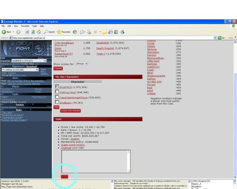
trying to view: "My Clan" get me a server error.
{EQ}Viperboy
October 19 2007 10:15 AM EDT
SUGGESTION
I noticed in auctions, when you select "Rare Items" the list is Armor, Weapons, and then Tattoos, BUT when viewing "Hot Items" the list is Weapons, Armor, and Tattoos instead.
I recommend for consistency sake so it wouldn't be confusing, to maintain the same order throughout, so either do Armor, Weapons, Tattoos, or Weapons, Armor, Tattoos.
Kong Ming
October 19 2007 10:17 AM EDT
For selling of items in auctions, I remembered we used to be able to view the past prices on the page where the min prices and BIN prices are put in. Can we have that back in the new format?
SNK3R
October 19 2007 8:51 PM EDT
What happened to the "You are allowed x MPR in your clan" in Clans > Admin? Maybe I don't see it anymore because I'm in an E-clan, or I don't see it somewhere?
Maelstrom
October 19 2007 10:00 PM EDT
SNK, I don't see the MPR allowance info in my standard clan admin page, either. That info really needs to be included.
Maybe have the 'Net Score' centered, same with the character name under the Members category.
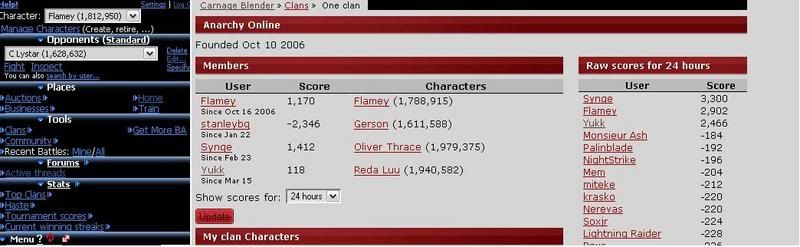
Flamey
October 20 2007 6:37 AM EDT
Those buttons are hot!
IndependenZ
October 20 2007 8:10 AM EDT
About the buttons in clans (Update and Edit), one has a background that lights up in darker gray and one doesn't. When you go there with your mouse pointer, that is.


Not that it really matters, but then again, I'm a perfectionist ;)
AdminJonathan
October 20 2007 8:55 AM EDT
Okay, I think I've addressed all the bugs posted. And I'm happy with how things look, so that topic is closed, bug reports only for auctions / clans now please. :)
Flamey
October 20 2007 8:58 AM EDT
That black bar that appears at the top of the main frame with any of the redone pages?
AdminJonathan
October 20 2007 9:01 AM EDT
What browser are you using? I don't get a black bar in FF/IE. If it is not one of those, tough. :) If it is, post a screenshot.
Flamey
October 20 2007 9:29 AM EDT
Flamey
October 20 2007 9:31 AM EDT
QBsutekh137
October 20 2007 10:45 AM EDT
Yeah, for me it is more like a grey bar, but it certainly doesn't look like it is supposed to be there... FF on OSX...
Flamey
October 20 2007 10:46 AM EDT
Whoops, sorry, I'm on the latest FF.
Flamey
October 20 2007 10:48 AM EDT
Sorry to like quadrillion post, but that's with all the modified pages, so on auctions too.
Also, the first post with a screenshot didn't work, so could an admin kindly remove that please.
[RX3]Cotillion
October 20 2007 11:03 AM EDT
I'm not sure if you noticed, but the spacing for Item, Price, NW, BIN, and Ends aren't the same for each item category.
Also, maybe you could change the order to Item, NW, Price, BIN then time left. It's kinda weird having the NW between the price and BIN.
SNK3R
October 20 2007 4:18 PM EDT
So, uh, what pages are next for face-lifting? :P
AdminJonathan
October 21 2007 2:38 AM EDT
If Pixel or someone else can suggest a solution to the FF/OSX problem (I'm guessing that is Flamey's environment too?), great. Otherwise, I suggest filing a bug report with Mozilla. :)
You'd best to use the DOM Inspector to find out what css rule is applying that style. Then it can be addressed.
AdminJonathan
October 21 2007 2:50 AM EDT
Obviously though it doesn't render that way in FF/windows. So I don't think knowing what style it is will help much.
It's a first start in finding a workaround. It has something to do with the overlaying of various styles. Since solid black is not really used anywhere, it might be possible to just delete the offending style.
If someone can give me a display on an OSX box, I'll troubleshoot it. Just set your DISPLAY to my ip and kick off firefox.
Flamey
October 21 2007 5:02 AM EDT
Jon, I'm using Windows XP, SP2 with Firefox version 2.0.0.8.
Nerevas
October 21 2007 11:32 AM EDT
I get an error when trying to go to my clan's admin page (Wrath). I'm using latest FF.
AdminJonathan
October 21 2007 12:35 PM EDT
> I get an error when trying to go to my clan's admin page (Wrath). I'm using latest FF.
fixed
QBsutekh137
October 23 2007 12:28 AM EDT
OK, I think the black bar across top is with Modern Mono. Happens on FF/OSX as well as IE7/WinXP. if I switch to "default" theme, both are fine, the box is just a slightly darker gray stripe.
In any case, it isn't just FF and it isn't just OSX. But it does appear to be a Modern Mono issue. Flamey, is that the theme you are using?
SNK3R
October 23 2007 1:12 AM EDT
Also happens with SNK3R, theme. I thought I already posted about this earlier in the thread?
SNK3R
October 23 2007 1:13 AM EDT
I did; it's the 9th post down from the top. Way to read, guys. :P
Flamey
October 23 2007 3:34 AM EDT
Psionic blue, SNK mentioned that it was most of the other themes, I think.
QBsutekh137
October 23 2007 10:56 AM EDT
Yes, SNK, I know it has been posted... It also appears to have been dismissed by Jonathan further down, so I wanted to make clear it was not just an FF or an OSX thing.
If it's an issue with using old themes mixed with the new engine, I think that going to get back burnered until we actually start converting the themes... just a guess.
QBsutekh137
October 23 2007 11:08 AM EDT
Not to mention the fact that the little elusive black bar doesn't really hurt a thing. *smile* I sure don't want to make a mountain out of the molehill.
Ah, ok, this is easy. The Modern Mono theme is applying the picture "http://www.carnageblender.com/img/themes/modernmono/hatching.png" to that table cell manually.
As novice said, until other themes get ported, just ignore it or switch.
QBsutekh137
October 23 2007 11:17 AM EDT
Excellent, thanks NS!
AdminJonathan
October 23 2007 4:13 PM EDT
thanks for tracking that down, NS
Miandrital
October 24 2007 1:15 AM EDT
Slight auction problem:
In the previous auctions link that is autogenerated (http://carnageblender.com/gc/search-2.tcl?category=Armor&only_expired_p=1&only_with_bids_p=1&one_line=Pair%20of%20Tulkas%27%20Gauntlets&sort=expires) the "category=Armor" should be "category=armor"
Miandrital
October 24 2007 1:18 AM EDT
Clarification: this is when you try to sell an item via auctions, that is the auto-generated link I am referring to.
Additionally, when you try to auction a weapon the category is still set as "Armor" when it should be "weapons".
If this has been posted elsewhere, it is my bad, I just don't read the forums much anymore.
QBsutekh137
October 24 2007 4:27 PM EDT
Fanta already stated way up, but I could not find an obvious response:
Are supporter names no longer going to be in italics in the new engine?
AdminG Beee
October 24 2007 5:20 PM EDT
As far as the store is concerned it would be pretty cool if when opening the weapons store the three sections were "collapsed". A simple click of the mouse on Ammo, Melee or Ranged would take you to the section you most wanted to visit with the need to scroll.
Same applies, and is actually more relevant for the armour store.
Scrolling is a pain when (like me) you play on a laptop with no mouse :)
Flamey
October 24 2007 5:24 PM EDT
AdminG Beee
October 24 2007 5:43 PM EDT
Slow brain day...
That would be cool though :)
btw no more sell another item link in auctions if you're done placing one item in auctions?
Auctions would look good with Tabs.
Maelstrom
October 27 2007 8:44 AM EDT
I think this has been mentioned before, but in auctions, the columns are listed in the order:
Item, Price, NW, Buy now, Ends
but it is quite confusing to have NW in between Price and BN. The order should be:
Item, NW, Price, Buy now, Ends
In clan stats page, why are all the buttons red with white letters, but the chatmail clan "send" button has black letters?
the letters are white on my screen
they're white if i highlight the button, =)
you sure you're looking at the "Send" clan chatmail button?
Flamey
October 27 2007 11:00 AM EDT
They're all white writing for me, as well.
mine does that as well. firefox here.
the auctions page "search" button is that way as well for me.
and I'm actually using IE and it has the black letters.
Maelstrom
October 27 2007 1:14 PM EDT
Do you get black letters if you use the default theme?
mine is happening with the default theme.
48Zach
October 27 2007 3:37 PM EDT
I use IE7 and mine are white.
Miandrital
October 28 2007 3:06 AM EDT
They show up black in IE6 because IE thinks that it is a visited link (those aren't really buttons, they are text links that have been dolled up using css), and therefore it changes the color of the text in the link. There is probably a way to force browsers to prevent them from doing that, but I don't really know what it is.
{cb1}Linguala
October 28 2007 5:47 PM EDT
Dunno if this has anything to do with the re-theme going on, but the heal option that shows up when your injured, leads to a completely ignorable effect.
The message that your minions are healed is imo completely redundant.
It's obvious that your minions get healed when you push that option, why display it?
Save some server load, use 6 letters less, drop the healed message.
P.S.: Sorry if this doesn't belong here.
AdminJonathan
November 1 2007 10:17 AM EDT
Closing this thread; please talk about the Home re-theme in that thread.
This thread is closed to new posts.


