Here are a couple ideas I had brewing since Lamuness was asking for redesign ideas. These are general ideas, the little icons and such are garbage and would need to be done right, and colors are always up for debate (though maybe with a redesign we can bring back skinning in a "proper" manner). This is still non-graphical with the exception of some icons, but we gotta start somewhere. (=
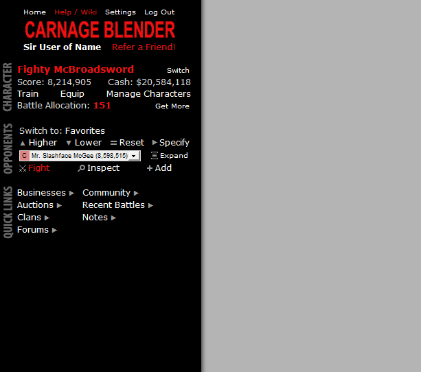
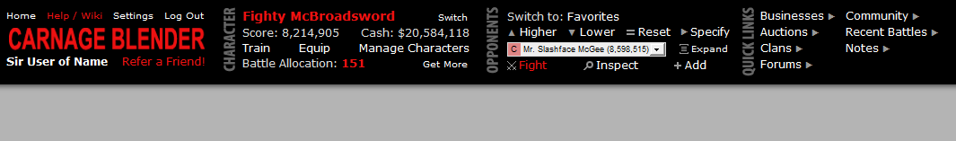
First the "safe" version which still uses the left frame. I basically just tightened things up into "modules" a little bit, added a few minor things here and there. (I don't think this saves much vertical space but pulling BA into character panel gets rid of an extra "box".)
Some things to note:
- Very sparse color usage to call out what I think are the 3 most important things (current character, BA left and the fight button)
- Character: Added cash to the display
- Character: Switch would just display a little popup with your current characters and a link to the Manage Characters screen
- Opponents: The "C" clan designation would have a different background color so it's even easier to pick out in the dropdown. Non-clan users would be indented the same amount with no C or background color. The comatose asterisk should go after the C but before the character name to keep things lined up. [I think this would have to be done via a background image on the option element.]
- Opponents: The fight icon is terrible, but I like the idea of crossed swords like that
- Opponents: "Expand" link... more on that below
- The logo box isn't sized (or, you know, a real logo) for this one, so the logo etc could be wider to match the other widths (or not)
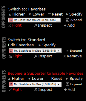
And the 3 versions of the Opponents panel depending on your standard/favorites selection, and one if you're not a supporter.
I initially created this all across the top. It may be too different but it's the same idea as above, just horizontal. However there is no room for a fight feed this way (not that it's included in the sidebar comp either). The font sizes and such can be toyed with to make it less wide as well, I'm not going through all that effort to make a slimmer one. (= If we went this route we'd definitely have to have a separate mobile layout.
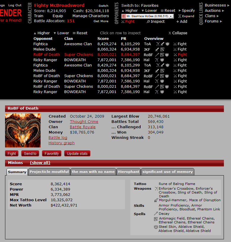
One of the bright ideas I had was an "expanded" opponents list panel though, which I think would be invaluable in the low and middle levels. The idea is basically a non-dropdown list of the opponents in the dropdown, with a super easy way to inspect them quickly and in a little nicer way with some additional information. When expanded, it remains open until it's closed, and the battles/inspect/normal content just displays under it. This could still be implemented even with a sidebar design.
Another minor addition that I think would be helpful is separating out the weapons and spell types on the inspect summary screen; we have plenty of real estate for some extra lines, and it makes it easier to identify things when you're looking at fully equipped multi-minion teams. Real icons would have to be made here (most were Google-stolen and modified), but you get the idea. Other than that, nothing else was changed on the inspect screen in this mockup (which is why the background and tab colors are a little wonky).
Even further, this list view could have the same set of icons indicating what types of damage and tattoo the character used. This wouldn't be super detailed (e.g. no differentiation between different ED spells). Imagine how awesome it would be to pinpoint types of characters to focus on or avoid at a glance -- RoBF characters, characters that don't used ranged weapons, characters which don't use direct damage spells... The low game wouldn't be quite as tedious, and newer users figure out how to pick targets easier.
So... rip it apart, complain about the colors, improve upon it... but maybe a couple individual ideas may stick.